What is a squeeze landing page you ask? Well, actually there are four types of squeeze pages depending on the type of traffic you are using. These are a squeeze page, a landing page, a capture page,and then a splash page.
Here are 5 different squeeze pages that you can get started with right now!
A squeeze page is a landing page designed to capture opt-in email addresses from potential subscribers. The goal of a squeeze page is to convince, cajole, or otherwise ”squeeze” a visitor into providing one of their most sought-after and coveted pieces of personal data: the email address.
The best way to squeeze an email out of a potential subscriber is give them an offer they simply cannot refuse. This offer can be a valuable piece of software,a free consultation, or a free podcast series. The best “ethical bribes” or free offers are the ones that the subscriber can ACTUALLY use and brings VALUE to the subscriber.
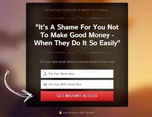
A typical squeeze page has a catchy headline, in some cases a sub-headline, bullet points that explain the features and benefits of the offer, two fields for a person’s name and email address, and a clear call-to-action button that states something like Signup Now!
The best types of traffic to use with squeeze pages are solo ads, and ppc traffic. The image below is a perfect example of a squeeze page.
A landing page in Internet marketing is a standalone web page, created specifically for the purposes of marketing or advertising a particular offer. It’s where a visitor “lands” on after they have clicked on a link.
So when you are sending traffic to your affiliate links, and a potential subscriber clicks on that link, they will “land” on whatever page that link takes them too, such as a video, a Facebook fanpage, or a blog post on your website.
When you send people to a landing page, make sure you have a clear Call-To-Action on what you want the visitor to do next. The best types of traffic to use with landing pages are solo ads, and ppc traffic.
A capture page or lead capture page is a type of landing page that helps you collect leads for your promotions. This is the SOLE goal of the capture page and that is to get the email address.
The best lead capture pages have the following elements in place:
Attention-grabbing headline: Your headline needs to be creative and encourage readers to stay on the page. The best way to do this is to have an eye-popping headline and “message match” with your marketing campaigns.
Call-To-Action button with personalized ad copy: The CTA button should have color contrast with your page and use verbiage such as, “Send Me the Ebook” or “Download My Checklist”.
Optimized lead capture form: The number of form fields depends on your offer and must be organized in an easy-to-convert manner. With other articles that I have read and with my own experience, the fewer the form fields the better.
Relevant image: Your lead capture page should also have eye-catching photography or custom graphics. If you’re promoting a webinar, include the host’s headshot. Are you promoting a free trial for an offer? Include a graphic or gif of your product.
Relevant ad copy: Your capture page copy should explain everything about your offer. But the copy can also be a “teaser” as well — just enough to give the visitor no other choice but to give up his/her email address.
Also, organizing copy in a bulleted list makes it easier for people to read than blocks of copy. This “teaser” copy should only be a headline and a sub-headline, nothing more. Remember, the goal of the capture page is to get the email address!
Other than the five primary elements above, lead capture pages can also have the following components to boost its credibility and increase chances of lead generation.
Customer testimonials: Positive customer reviews help future customers see the value in your service. Make sure that these are legitimate customer testimonials.
Customer badges: Include company logos of businesses who have used your service to show potential customers how many companies you cater to currently and in the past. If some of your clients are notable companies, visitors feel reassured when they sign-up.
Trust seals: Trust seals work best for e-commerce lead capture pages as they ensure the visitors that the payment information they have entered will be kept safe. VeriSign, PayPal, and SSL logos are all examples of trust seals.
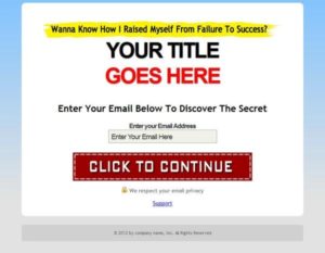
The best types of traffic to use with capture pages are ppv and ppc traffic, solo ads, and traffic exchanges. This image below is a good example of a capture page.
A splash page is a typical page that contains minimal ad copy, a background image, a few bullet points that highlight the benefits of the offer, and most importantly a huge call-to-action button that takes the visitor to the main website.
A splash page can be a welcome screen to the main website or a teaser headline that gets visitors excited for the website they’re about to view. The best types of traffic to use with splash pages are ppv traffic and traffic exchanges.
Here is an excellent example of a splash page.
So there you have it. These are the different types of landing pages used widely by Internet marketers and other successful online businesses alike to get more leads and sales.


